You are using an out of date browser. It may not display this or other websites correctly.
You should upgrade or use an alternative browser.
You should upgrade or use an alternative browser.
Complete vendetta super recargado 4.0
No permission to download
- Thread starter monomartin
- Start date
Project is completed.
machok
Well-known member
Uploaded to resources and removed third party link. Assigned to @monomartin and associated resource to discussion thread.
DC
DC
dai92
Well-known member
Strange buddy i just did the Double Dragon Route and had no issues atall "I also recorded it im uploading it now"
machok
Well-known member
When you beat all enemies there before keep going through yes You won't find any problemsStrange buddy i just did the Double Dragon Route and had no issues atall "I also recorded it im uploading it now"
@monomartin
I found at least 2 problems while playing,
1. When player throw enemy to down platform just like in my video. Enemy unable to jump up and the screen is locked, so players can't go back down either.
this makes the game stuck
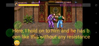
2. Night Slasher Doctor Boss (the one throwing granades), when player accidentally fell to the lower platform and the boss followed him. then the game will continue without need to fight this boss at all. Can't tell if this is intentional or not.
dai92
Well-known member
That Night Slashers Doctor Boss was super annoying for me when i played. He kept jumping up and spamming granades constantly and you cant attack him when he does that. I almost quit playing it there and then hahaha.When you beat all enemies there before keep going through yes You won't find any problems
@monomartin
I found at least 2 problems while playing,
1. When player throw enemy to down platform just like in my video. Enemy unable to jump up and the screen is locked, so players can't go back down either.
this makes the game stuck
2. Night Slasher Doctor Boss (the one throwing granades), when player accidentally fell to the lower platform and the boss followed him. then the game will continue without need to fight this boss at all. Can't tell if this is intentional or not.
I guess i got lucky that i didn't run into bugs but by the sounds of things it needs some extra work for sure buddy.
William999
Active member
Finally, thank you, my friend! Come and comment after I play.
Hanzo
Well-known member
After playing around with it, I gotta say the mod is really fun but there are some issues like the platforming parts where you need to jump across, the level design is off in some areas. Marcus has a head butt dash move which can jump across the gap just fine. Plus there is too much momentum when you run or jump. Otherwise it is a cool mod but there is need to be some small changes to the running animations for the characters.
O Ilusionista
Captain 100K
I remember that you don't like feedback very much (and that you also don't like me very much because you were angry the last time someone gave you feedback and I told you that you didn't need to react that way), but I think it's worth posting some points here for there to be an evolution in the game, as I see that there is great potential here.
I tested your game and I see two big points in it - one good and one bad.
Good Point:
I really like how you work with the scenarios, it's one of the most creative ways I've seen in OpenBOR. I even analyzed your previous game, and the use of scrollz combined with walls is incredible. The feeling of continuity is something interesting. Even if some parts have a slight difference in style between them (which could be fixed by changing the palette of the images), the result is incredible, congratulations. It looks like a "professional game".
And I liked the use of one of the Street Smart bosses, as his style suits the game.
Bad Point:
There is a huge lack of cohesion in the sprite styles, which ends up killing the "professional game" feeling and affecting the quality of the final product. And this happens in your other projects too.
I'm going to use @dai92's video to show you some points
This image sums up this problem well:

- Notice the red dots - there are entities that use a solid black shadow, while there are entities that use a semi-transparent, blurry shadow. This mixture looks very strange, you can easily fix this by changing the default OpenBOR shadow that you are using on the enemy with the shield to a solid black circle.
The correct option would be for everyone to use the same type of shadow - either the shadow on the ground with the outline of the characters (as shown in the player) or a circle on the ground in black. But, to do this, you would need to delete the black shadow from the original sprites (I did this when I used this forklift sprite). But if this is too much work, you can choose to simply use the default black shadow, just placing it as an all-black circle, instead of a gradient sprite.

- notice the pink dot: the sprite style has nothing to do with the rest of the game, which looks very strange. It's precisely what breaks the immersion of the game and affects the quality of the final product, which looked like a professional game but these points really harm the experience.
Sometimes you use sprites without transparency in the effects (which I think works much better), sometimes you use sprites with transparency. One example is Hawk's special, which uses an effect from CVS2 that is completely out of character with the game...

..while others use it

---
I think this is a point that could be reviewed, as it unfortunately reduces the quality of the work as a whole, which is a waste since there are so many interesting ideas.
Other points of attention:
- You can put "setlayer -1" in the blood, so that it is always shown below the sprites and not above them like here

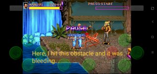
- Some obstacles, like this one, emit a blood effect if hit by the whip, which doesn't make much sense.

- It's normal for there to be some difference in style when using sprites from different platforms, but in some cases you could smooth this out if you edit the characters' palette, as is the case with the enemy with a shield that came from E-Swat. Or on the woods parts of those platforms:

I hope you receive this feedback well. And understand that this is not an attack on you or your work.
Keep up the good work.
edit: I was going to show you how to fix the shadow, but there is a file under yout bgs which uses a special character, so the unpacker doesn't work well


Edit2: I managed to extract the files and fix the shadow, take a look:

I tested your game and I see two big points in it - one good and one bad.
Good Point:
I really like how you work with the scenarios, it's one of the most creative ways I've seen in OpenBOR. I even analyzed your previous game, and the use of scrollz combined with walls is incredible. The feeling of continuity is something interesting. Even if some parts have a slight difference in style between them (which could be fixed by changing the palette of the images), the result is incredible, congratulations. It looks like a "professional game".
And I liked the use of one of the Street Smart bosses, as his style suits the game.
Bad Point:
There is a huge lack of cohesion in the sprite styles, which ends up killing the "professional game" feeling and affecting the quality of the final product. And this happens in your other projects too.
I'm going to use @dai92's video to show you some points
This image sums up this problem well:
- Notice the red dots - there are entities that use a solid black shadow, while there are entities that use a semi-transparent, blurry shadow. This mixture looks very strange, you can easily fix this by changing the default OpenBOR shadow that you are using on the enemy with the shield to a solid black circle.
The correct option would be for everyone to use the same type of shadow - either the shadow on the ground with the outline of the characters (as shown in the player) or a circle on the ground in black. But, to do this, you would need to delete the black shadow from the original sprites (I did this when I used this forklift sprite). But if this is too much work, you can choose to simply use the default black shadow, just placing it as an all-black circle, instead of a gradient sprite.
- notice the pink dot: the sprite style has nothing to do with the rest of the game, which looks very strange. It's precisely what breaks the immersion of the game and affects the quality of the final product, which looked like a professional game but these points really harm the experience.
Sometimes you use sprites without transparency in the effects (which I think works much better), sometimes you use sprites with transparency. One example is Hawk's special, which uses an effect from CVS2 that is completely out of character with the game...
..while others use it
---
I think this is a point that could be reviewed, as it unfortunately reduces the quality of the work as a whole, which is a waste since there are so many interesting ideas.
Other points of attention:
- You can put "setlayer -1" in the blood, so that it is always shown below the sprites and not above them like here
- Some obstacles, like this one, emit a blood effect if hit by the whip, which doesn't make much sense.
- It's normal for there to be some difference in style when using sprites from different platforms, but in some cases you could smooth this out if you edit the characters' palette, as is the case with the enemy with a shield that came from E-Swat. Or on the woods parts of those platforms:
I hope you receive this feedback well. And understand that this is not an attack on you or your work.
Keep up the good work.
edit: I was going to show you how to fix the shadow, but there is a file under yout bgs which uses a special character, so the unpacker doesn't work well
Edit2: I managed to extract the files and fix the shadow, take a look:
Last edited:
machok
Well-known member
@monomartin
maybe give player few seconds invisibility when rise?
You don't need to follow my advice if you don't want to it's your game, I just want this game to be more fun to play for all fans.
maybe give player few seconds invisibility when rise?
You don't need to follow my advice if you don't want to it's your game, I just want this game to be more fun to play for all fans.
O Ilusionista
Captain 100K
I managed to extract the files and fix the shadow, take a look:

I second that.maybe give player few seconds invisibility when rise?

NED
Well-known member
My feedback is basically @O Ilusionista 's feedback.
*also I like the fact you created some custom animations! and custom moves!
*I mostly played as Blood. his run animation can keep anormal head position, no neef to actually more it for one frame.
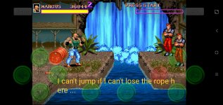
*Talking about Blood. he's the only way I found to jump across a hole because runing jump is not enough, so I always end up playing as him using Run + A2 to jump over holes.
*Why not adding a female in the roster ? since ou added one more guy ^^
*also I like the fact you created some custom animations! and custom moves!
*I mostly played as Blood. his run animation can keep anormal head position, no neef to actually more it for one frame.
*Talking about Blood. he's the only way I found to jump across a hole because runing jump is not enough, so I always end up playing as him using Run + A2 to jump over holes.
*Why not adding a female in the roster ? since ou added one more guy ^^
@monomartin
+1 to @O Ilusionista feedback. Plus I saw you got many assets from the SOR2X but honestly most effects I used in this game are wrong and do not fit due to its high resolution, mainly dust and explosion.
I suggest changing the sprite style to a most compatible low res type (I saw you already have a proper dust, maybe you could use only this one), similar to most hitflashes you already are using. Another suggestion is to replace the Final Fight font, maybe creating a custom one.
Other than that the game has a big potential, keep doing your good work buddy")
+1 to @O Ilusionista feedback. Plus I saw you got many assets from the SOR2X but honestly most effects I used in this game are wrong and do not fit due to its high resolution, mainly dust and explosion.
I suggest changing the sprite style to a most compatible low res type (I saw you already have a proper dust, maybe you could use only this one), similar to most hitflashes you already are using. Another suggestion is to replace the Final Fight font, maybe creating a custom one.
Other than that the game has a big potential, keep doing your good work buddy
O Ilusionista
Captain 100K
@monomartin while its not a rule, its always polite to give credits when you get something from another dev.Plus I saw you got many assets from the SOR2X
for example, I do plan to use some stuff from your project and credit you for sure.
We all are here to help each other
")
Borkjh
Active member
You seems always complete mod quickly.ok let's see if I did it right, change the status and add the link to the top
Maybe ripping sprites take almost time of openbor modding. Is there know how of ripping sprites faster?
William999
Active member
Friend, I’m here to give you feedback. The game is really good. All props and weapons are perfect. Thank you for your hard work!
The specific questions are below
The specific questions are below
Attachments
Whackadoo
Active member
Vendetta Super Recargado is super fun. Thank you so much @monomartin.
The gameplay is a step up from the arcade game, it's a joy beyond words to play your favorite game with an extended movelist.
Also what struck me most were the graphics: they are incredible. Tons of new enemies and effects. Many many thanks.
@O Ilusionista: the good advice you gave in this thread is gold. Also the fact that you gave it freely is truly kind.
Some game designers would have asked money for that kind of quality counsel. Quite frankly, I admire your integrity.
And for that matter, every single modder in this board") .
.
The gameplay is a step up from the arcade game, it's a joy beyond words to play your favorite game with an extended movelist.
Also what struck me most were the graphics: they are incredible. Tons of new enemies and effects. Many many thanks.
@O Ilusionista: the good advice you gave in this thread is gold. Also the fact that you gave it freely is truly kind.
Some game designers would have asked money for that kind of quality counsel. Quite frankly, I admire your integrity.
And for that matter, every single modder in this board
.