Appreciation for KOF pixel art: No one is ever going to draw like this again

ipkevin

Member
I just want to take a moment to appreciate the pixel art in the King of Fighters games. Sad to say, but no one will ever do pixel art like this again. It's WAY too hard and takes too long. Even in this current pixel art renaissance revival era we're in, you'll notice that all modern pixel art is usually a chibi cutesy/chunky style. Or at best a Capcom-esque "flat shaded with dark outline" cartoon style. Because they are easier to do. As hard as any good pixel art is to make, KOF's style is even harder. It has complex shading & tones (look at Terry's arms!) while using very little or no dark outlines. Plus, the base drawing itself is just very good, totally solid. And the way they converted complex shapes into seemingly random jumble of a few pixels that somehow looked perfect at distance (look at the fingers in Terry's fist in the first picture) was absolute genius.

Even SNK themselves weren't able to keep it up - Some of Terry's frames from later games look noticeably worse, plus SNK's later games like Last Blade and Garou moved on to a more Capcom-esque style. Nothing wrong with those games - they're totally gorgeous too - but they're not the same as KOF.

So, SNK & KOF, I salute you. Thanks for bringing this gift to the world.


terry01.pngterry02.pngterry03.png
 
 
Yeah, but hey... somebody's at least trying:


And this doesn't even begin to cover the breadth of SNK Mugen authors doing stuff.

What's an even more lost art is the pre-Darkstalkers Capcom look, which was also copied by many, many developers back in the day, even some Western ones.
 
Last edited:
Yeah, but hey... somebody's at least trying:


And this doesn't even begin to cover the breadth of SNK Mugen authors doing stuff.

What's an even more lost art is the pre-Darkstalkers Capcom look, which was also copied by many, many developers back in the day/

Yep, looking at Final Vendetta with antipation. It's nowhere close to classic KOF standards, but it still looks good.

By pre-Darkstalkers Capcom look, you mean that style they were developing from SF2 and the beat em ups through until Super Street Fighter 2 and Cyberbots? Yeah, everyone tried to rip off that look and what was crazy was that no one else really pulled it off. Not even close. I see the likes of Agressors of Dark Combat and World Heroes as failed attempts to copy that visual style (even tho I like them on their own terms). Maybe sorta you could argue Sam Sho 1 & 2 were going for that look and did it well, but you could also argue they were already diverging into their own thing.

Do you have some examples of fanmade Mugen chars in the SNK style? I've seen some poses and mockups that were good, but most of the full characters are just existing SNK chars with a new head & some recoloring. Would love to see some. I see plenty of CapVsSNK style original mugen chars (again, going back to my point that that style is easier to pull off) but not too many KOF style ones.
 
Last edited:
Yep, looking at Final Vendetta with antipation. It's nowhere close to classic KOF standards, but it still looks good.

By pre-Darkstalkers Capcom look, you mean that style they were developing from SF2 and the beat em ups through until Super Street Fighter 2 and Cyberbots? Yeah, everyone tried to rip off that look and what was crazy was that no one else really pulled it off. Not even close. I see the likes of Agressors of Dark Combat and World Heroes as failed attempts to copy that visual style (even tho I like them on their own terms). Maybe sorta you could argue Sam Sho 1 & 2 were going for that look and did it well, but you could also argue they were already diverging into their own thing.

Do you have some examples of fanmade Mugen chars in the SNK style? I've seen some poses and mockups that were good, but most of the full characters are just existing SNK chars with a new head & some recoloring. Would love to see some. I see plenty of CapVsSNK style original mugen chars (again, going back to my point that that style is easier to pull off) but not too many KOF style ones.
1. Yes, my main problems right now are the size of the heads. Seems slightly more, erm... "chibi" than KOF proper.

2. Yes. The look died out after Cyberbots, though D&D, Battle Circuit, Strider 2, and Megaman X4-6 had a sort of refined version of it that was somewhere in between old and new Capcom. I find it a bit funny Megaman X did SF's art-style shift/evolution, just in reverse, from the simpler SNES games to the 32-bit entries, which seemed to go along well with the tone shift the series had after X3. (X3 did have some dark subject matter, but it wasn't as horrificaly emphasized as later games, which feel too bleak at times with basically every "enemy" faction being wiped out completely (except for Axl, for some reason) and forgotten about, even being remembered as monsters by the time of Zero). The Zero/ZX series went with a further tweaking of the style, which would lead into the Gunvolt series.

And yeah, SNK's attempts to copy the style were probably the best-looking. It's funny how both SNK and Capcom diverged from the general aesthetic everyone else was doing at the same time. Heck, there were a handful of stragglers in that sort of style, like Breakers and Double Dragon. Even some Western studios tried this look, see Eternal Champions, Fighting Spirit, etc. However, many failed miserably, such as Body Blows.

3. One of the best ones I can find is Super Crazy Jam:


Maybe I'm the wet blanket, but I never liked KOF's art style. I think it's ridiculously overrated, and seems to become more so as time passes. IMO the KOF sprites are too treated, too grainy, too simple, and the animation is extremely inconsistent. Yes, I said too simple. Start with a flat light source from the viewpoint, add treatments until you run out of room or colors, and call it a day. Don't try to trot out Garou as an example either. It's just as grainy, and the particle effects are even worse. At least Garou has consistent animation, I'll give you that.

I prefer the cleaner look Capcom experimented with in Darkstalkers, refined in the Alpha series, and reached a pinnacle with CVS. It may look simpler, but requires much more artistic talent. The light source is overhead, and instead of just adding shades, colors are devoted to breaking up the color bands. The guys over at Mugen can reproduce KOF all day, but 20 years on no one has managed to fully replicate the CVS style.

CVS2_Geese_531.png

It's not like SNK couldn't do good artwork when they wanted to. Check out Samurai Shodown or the Real Bout series. I'm also a fan of ADK, Noise Factory, and Dotemu's work. Real Bout in particular shows SNK at their best. The animation may not be on par with some of KOF, but it's far more consistent across the board, and they weren't afraid to experiment a little. Look at Kim's left handed stance, or how most fighters are drawn at a 3/4 stage turn to make them pop off the screen. The most creativity you get from KOF is doubling down on shonen anorexia and moar cloth treatments! :p

rb_kom_0.png

Here's another example: Real Bout Mai vs. KOF Mai. KOF uses better colors, but the Real Bout sprite has much more depth and expression despite being over five years older. Pay particular attention to her hips and legs. Real Bout Mai is shapely and attractive - like Mai is meant to be in cannon. KOF Mai is stringy and over shaded to the point her skin looks rough. The light source is always "you", whereas RB Mai's lighting is more neunced. The difference becomes even more profound once animated. Real Bout Mai has the same basic move set, but her strikes look smooth and powerful. She throws them from her body like a trained fighter. KOF Mai moves more like a marionette puppet.

kof_mai_0.pngrb_mai_0.png

That's just one example. I could dredge up stuff like SVC Chaos Ryu vs. CVS Ryu, but that doesn't even seem fair. Anyway, it's just my opinion, nothing more. SNK can, could, and did do fantastic artwork, but to me the KOF series is the bottom of their barrel.

DC
 
The only KoF sprites I ever liked were number 13, I like the dull palette and contrast combined

EtENfVJ.gif


Real bout and Art of Fighting 2 are some of my favourite sprites from SNK, KoF generally I've never really been a fan of.
 
About CVS… yeah, there are a lot of authors attempting to recapture it, but few, if any, have succeeded. I do prefer the DS-MVC2 style more, because the colors feel more vivid and the animations more snappy. I’m fine with CVS style, though, just prefer my art assets to fit together better, and CPS2 has more characters in its style anyway. (Though early characters like Morrigan could stand to get do-overs)


Sf3 style is impressive but difficult due to the number of colors (7 shades per color) and frames. Pre-Darkstalkers is even more difficult despite still being 15 colors+ transparency due to how shading and the shaping of musculature is handled.
 
Maybe I'm the wet blanket, but I never liked KOF's art style. I think it's ridiculously overrated, and seems to become more so as time passes. IMO the KOF sprites are too treated, too grainy, too simple, and the animation is extremely inconsistent. Yes, I said too simple. Start with a flat light source from the viewpoint, add treatments until you run out of room or colors, and call it a day. Don't try to trot out Garou as an example either. It's just as grainy, and the particle effects are even worse. At least Garou has consistent animation, I'll give you that.

I prefer the cleaner look Capcom experimented with in Darkstalkers, refined in the Alpha series, and reached a pinnacle with CVS. It may look simpler, but requires much more artistic talent. The light source is overhead, and instead of just adding shades, colors are devoted to breaking up the borders and creating smooth lines. The guys over at Mugen can reproduce KOF all day, but 20 years on no one has managed to fully replicate the CVS style.

View attachment 1359

That's just one example. I could dredge up stuff like SVC Chaos Ryu vs. CVS Ryu, but that doesn't even seem fair. Anyway, it's just my opinion, nothing more. SNK can, could, and did do fantastic artwork, but to me the KOF series is the bottom of their barrel.

DC

I'm going to reply in sections, but be warned it's still a wall of text incoming.

SNK's problem was consistency:
The issue with KOF style is that it was not done consistently, not even by SNK themselves. SVC Chaos sprites almost look like they were made by Mugen amateurs under a time crunch instead of the pros that created those Terry Bogard sprites above. Even basics like proportions, anatomy, and drapery look off in some cases, nevermind how the shading is applied or liveliness of movements. Or as I said, look thru a Terry KOF mugen rip and you'll find later sprites that are appallingly bad, barely even the same style. I think SNK's poverty years & penny pinching hurt their output & thus legacy, but when I look at the best of the KOF sprites, I think they are stunning. The GOOD Terry sprites like the ones above are IMHO unparalleled and I've never seen an original Mugen SNK homage that comes close (I have the exact opposite view to you when it comes to rating ability of mugen fans to ape the CVS vs KOF styles!)

Flat light sources:
On your point of the flatter light source, there's nothing inherently wrong with that, it really just comes down to execution again. On the Terry above or KOF Ryo Sakazaki? It works beautifully and is executed with taste and skill. On the SVC Chaos Dan sprite? Horrid, gives me flashbacks to 90s comic books when colorists first discovered Photoshop's circular gradient & put a highlight on every raised surface.

Ryo KOF vs Dan SVC:
ryosakazaki.gif dan_svc.png

Capcom is the GOAT:
Don't get me wrong -- Capcom are the greatest 2D pixel art company of all time. I LOVE the Cap Vs SNK art and most all of the styles that Capcom have tried thru the years have turned out at least one great looking game. Their relentless drive on the art side even managed to take an old, washed up SNK concept artist who I thought was overrated (Shinkiro) and pushed him to evolve into one of the best & most unique concept artists of recent times.

The mad calculus of SNK's KOF pixel art:
But here's the thing: There's a magic in the way SNK translated the base art into low res pixel art that is completely outside of the usual artist fundamental skills. The KOF pixelification ADDs something to the art that does not exist in the base art or concept art. It goes back to those curled fingers in Terry's fist in the 1st image above or the musculature in the arms in the 2nd & 3rd pics. They look like a jumble of random pixels when viewed up close. The thumb is just 4 or 5 pixels, but each pixel's color & placement is crucial! Yet when you zoom out, everything looks great and recognizable and stylish. There is genius in the way it's translated that is not obvious (and clearly was not obvious to all of SNK's artists over the years either). You could argue most other styles of pixel art (esp from Capcom) over time just got closer and closer to translating drawings as directly & accurately as possible to screen. You look at a CVS sprite and you can imagine what the base drawing looked like. You look at the Terry sprite and I have a hard time time imagining how exactly they got from the drawing to that arm, despite how good it looks.

Anyways, that's my 2 cents. I'm a SNK pixel art super fan, so it may be my own pedantic hair splitting, but it's why I love and appreciate them. We could maybe talk more objectively about artist fundamentals btwn the 2 companies, but discussion of style at some point just comes down to personal taste.
 
Last edited:
As much as I love the new crisp cvs2 sprites. There is just so many nice animation touches in the snk sprites of old. I was so disapointed that shiki, momo and the kiz encounter charas from kof 11 never got another game or even an obor game that would do them justice.

Also I must say the mugen kof98-2k2--11 compilations have a lot of really great original characters, which must have been a lot of work?
 
Well, about modern pixel art, there are indeed a lot of things that bug me: overly fat and rectangular heads with tiny beady eyes, faces without eyes at all or anything besides a nose or maybe a chin, overly desaturated colors leading to extremely dull palettes, a complete lack of outlines, one-pixel-thick limbs…

It’s as if they’re only copying from each other, not the old masters, and it leads to a lot of unappealing and samey games.
 
Last edited:
The only thing i can say is that i prefer Street Fighter 2's & most SNk shading styles better because characters kind of match best the same level of artistry used in the background.

One thing i don't like about cartoons is the fact that you cannot match the shading of the backgrounds to the animated characters, so that kind of aestetic clash always tickedme off. Recently this has changed, thanks to techniques featuring AI, like with Klaus or Arcane 1645658718878.jpeg 1645658826920.jpeg

1645658099300.jpeg
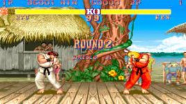
for example in this image, ryu & ken clearly belong & blend pretty well with their surroundings - i am sure that if it wasn't for sprite limitations of the time, they would have featured a bit more shading to match backgrounds even more.
BUt Another factor is the fact that CRT screens had away of blending shades, giving the games a consistent blend.

it is pretty impressive , since the only other way to do this is to use CGI in real-time
1645658546926.jpeg
on the other hand:

images

(there are worse examples) the characters here need at least 2 other shades to match their background a bit better.

so that is why i like those snk sprites & street fighter 2 sprites are technically better, cel shaded sprites with non-cell shaded backgrounds really annoy me
1645659280535.jpeg
its like toons walking around in live action....
images
 
Oldyz, how would you go around making a cel-shaded background that doesn’t make the characters blend into it? The closest things I can think of are the 2007 GBA Ninja Turtles game and Comix Zone.
 
The only thing i can say is that i prefer Street Fighter 2's & most SNk shading styles better because characters kind of match best the same level of artistry used in the background.

One thing i don't like about cartoons is the fact that you cannot match the shading of the backgrounds to the animated characters, so that kind of aestetic clash always tickedme off. Recently this has changed, thanks to techniques featuring AI, like with Klaus or Arcane View attachment 1370 View attachment 1371

View attachment 1368
for example in this image, ryu & ken clearly belong & blend pretty well with their surroundings - i am sure that if it wasn't for sprite limitations of the time, they would have featured a bit more shading to match backgrounds even more.
BUt Another factor is the fact that CRT screens had away of blending shades, giving the games a consistent blend.

I never really fully considered that, but it's true. The early-mid KOFs whose backgrounds matched the sprites well looked especially great. It also didn't hurt many of the backgrounds had that special KOF pixel art feel and looked especially charming. Last Blade is another one with awesome BGs that also mesh with the sprites beautifully.

kkofbridge.jpg

That said, I think mismatched styles for backgrounds and characters can be an aesthetic. CVS still works for me despite a huge mismatch in styles.
 
Oldyz, how would you go around making a cel-shaded background that doesn’t make the characters blend into it? The closest things I can think of are the 2007 GBA Ninja Turtles game and Comix Zone.
Sorry about some of the big @$S images...

Making cell-shaded backgrounds by hand is pretty difficult, thankfully now-days any 3D models or background can be rendered as cel-shaded.

notable examples of cel-shady compatible enviroments here:
images
images
1645686242099.jpeg
images

unfortunately i cant bring myself to calling these "cell-shaded" since they feature more than one or 2 shadows or gradients.

true cell shaded backgrounds are probably very rare, windwaker & devastation examples look more like a Miyazaki cartoon at best or like 80's cartoon backgrounds at least

1645686432468.jpeg 1645686457394.jpeg

the closest i have seen to simple one-shadow no gradients art for backgrounds is found in 60's cartoons & cartoon network stuff like johny bravo
images
images
pink panther 1645686783541.jpeg
1645686804311.jpegbugs bunny 60's 1645686867888.jpeg

so if you want a one shadow sprite to blend in you got to make sure backgrounds feature only one shade, doing it manually is probably Hell.
a bit easier is to go like the johnny bravo diner example and use no shadows at all.

if you want the singel shadow shade sprite to stand out , make the background super simple , like the pink panther or 60's WB or Tom & jerry cartoons.


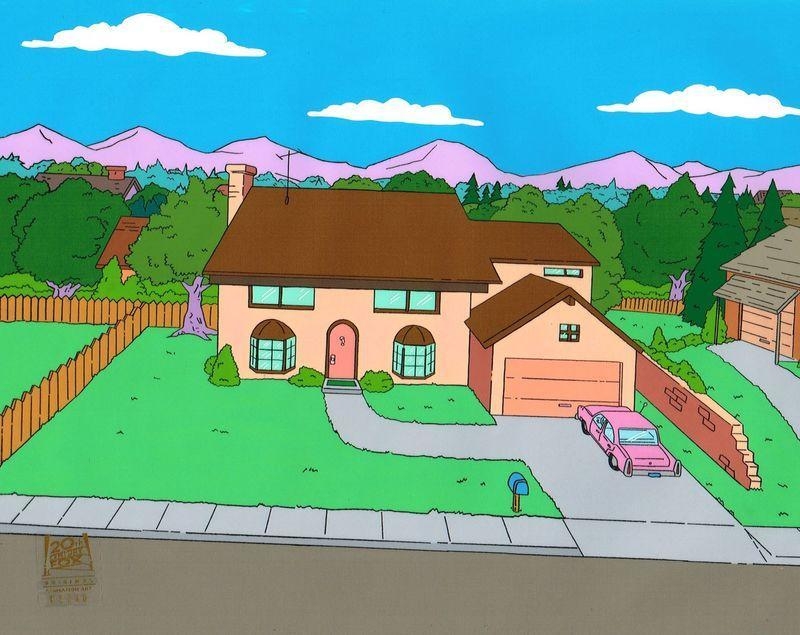
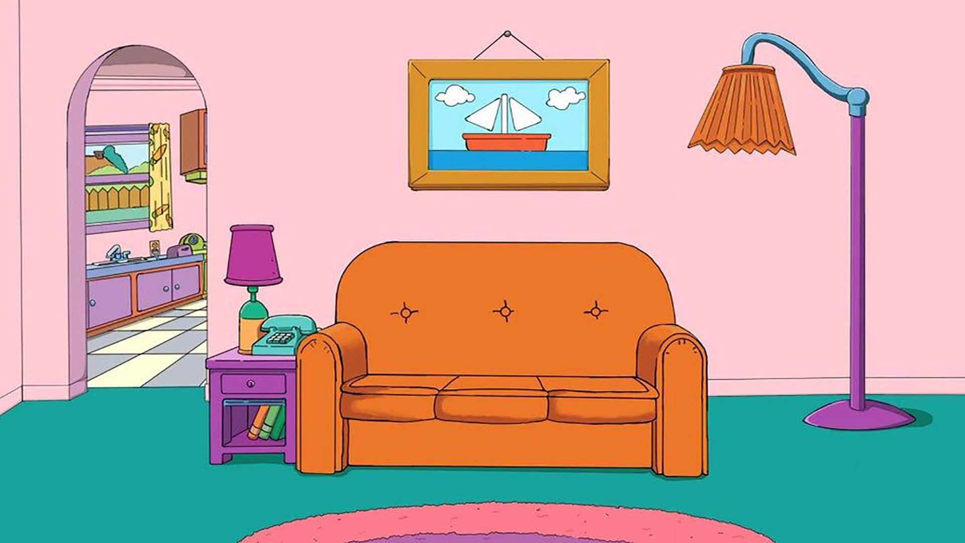
there is one cartoon that features a pretty consistent use of cell shaded - one shadow backgrounds & characters, the simpsons:

1603126000-625-5192-the-simpsons-house-background.jpg

usually if the characters have no shadows , the backgrounds do not either.

ANIDOM_TheSimpsons_4096x2160_03.jpg


for example in this kitchen, homer & marge would most probably feature 3 color shades or tones...
the bad news for capcom cell shaded games is this: most of the game's backgrounds would kinda look like simpsons or futurama backgrounds....

last


cgi vs "organic"

LIRaw1cj6UkDbfp6C6vq8DbTFgbhQsGP4ZQNKOvaEe8.png


simpsons-couch.jpg


note that for some reason, computer cell shading makes some objects have a gradient shadow effect, don't know if this is something that can be eliminated or tuned....
 
One of the better examples of someone copying the CVS art style would be Dampir, who converted many Capcom and SNK characters, along with some from other companies, even Taki from SoulCalibur. His work has declined in recent years, though.
 
@Miru

Cell shaded stuff takes a pretty good eye, not easy at all to choose where to make the shadow separation on complex designs, i think that now-days there might be some cheating by using 3D software to aid the creators. Who knows

have been looking at pixel art that was meant for CRT tho, makes me wonder it they where actually looking at CRT monitors from the start when drawing.
tha amount of "detail" they where able to simulate sometimes is fantastic

how they supposed to look.jpg

FJox4ckWYAInrt3
FJox4w6XsAUSw2g

Single pixels to red eyes...
E4vTYfmWEAIer6y
E4vTZSwWQAY2RqD
 
Back
Top Bottom