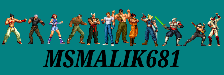
I just want to take a moment to appreciate the pixel art in the King of Fighters games. Sad to say, but no one will ever do pixel art like this again. It's WAY too hard and takes too long. Even in this current pixel art renaissance revival era we're in, you'll notice that all modern pixel art is usually a chibi cutesy/chunky style. Or at best a Capcom-esque "flat shaded with dark outline" cartoon style. Because they are easier to do. As hard as any good pixel art is to make, KOF's style is even harder. It has complex shading & tones (look at Terry's arms!) while using very little or no dark outlines. Plus, the base drawing itself is just very good, totally solid. And the way they converted complex shapes into seemingly random jumble of a few pixels that somehow looked perfect at distance (look at the fingers in Terry's fist in the first picture) was absolute genius.
Even SNK themselves weren't able to keep it up - Some of Terry's frames from later games look noticeably worse, plus SNK's later games like Last Blade and Garou moved on to a more Capcom-esque style. Nothing wrong with those games - they're totally gorgeous too - but they're not the same as KOF.
So, SNK & KOF, I salute you. Thanks for bringing this gift to the world.