mortal kombat outworld assassins mod

Gurtag

Active member
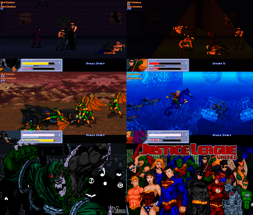
hey ppl, have been playing mkoa for years now, played so much that my fingers started to hurt at some point  :-\, anyway loved it so much that it motivated me in to lerning the engine and started to mess around with the code years back but not long ago decided to commit my self in to making a more serius addition to it, asked magggas about it and said yes, so now i want to show some of the progres i made to the community, i only recorded 4 stages sorry for the video cuality but could not upload better resolution due to my awful internet, any feedback is much apreciated.


This look's really great , And yeah maggga's is a really cool dude  :D looking forward to playing this if you finish it. Also if you need help with better quality video's you could pm me with a demo of your work and i can record it for you at 720HD 60fps. And upload it to my channel on youtube.

Love to help the community in what little way i can  ;D
 
Davpreec said:
This look's really great , And yeah maggga's is a really cool dude  :D looking forward to playing this if you finish it. Also if you need help with better quality video's you could pm me with a demo of your work and i can record it for you at 720HD 60fps. And upload it to my channel on youtube.

Love to help the community in what little way i can  ;D

thanks man i apreciate it, will do whenever i have some more stuff complete

nsw25 said:
MKOA is one of my favourite games and it looks like your project is shaping up nicely. well done. how did you code the jumpattack combos ? is it just a follow animation if jumpattack connects ?

there is some issues I see with level design, like tiles not looking right perspective and everything looking flat (that can be tweaked with brightness and contrast changes depending on how close they are to screen etc)

nothing fancy, just very shorted delay jumpattack1 and jumpattack2 with long pusetime on the attacks, they where allready on the original vercion, i just tweked them a bit, tiles not looking right perspective is really thing i know, i need to work more on the levels, but i am more in to added and build the bulk of the content first, will be tweking details later i save the ps files for everything, thanks a lot for your feedback
 
Gurtag said:
Davpreec said:
This look's really great , And yeah maggga's is a really cool dude  :D looking forward to playing this if you finish it. Also if you need help with better quality video's you could pm me with a demo of your work and i can record it for you at 720HD 60fps. And upload it to my channel on youtube.

Love to help the community in what little way i can  ;D

thanks man i apreciate it, will do whenever i have some more stuff complete

nsw25 said:
MKOA is one of my favourite games and it looks like your project is shaping up nicely. well done. how did you code the jumpattack combos ? is it just a follow animation if jumpattack connects ?

there is some issues I see with level design, like tiles not looking right perspective and everything looking flat (that can be tweaked with brightness and contrast changes depending on how close they are to screen etc)

nothing fancy, just very shorted delay jumpattack1 and jumpattack2 with long pusetime on the attacks, they where allready on the original vercion, i just tweked them a bit, tiles not looking right perspective is really thing i know, i need to work more on the levels, but i am more in to added and build the bulk of the content first, will be tweking details later i save the ps files for everything, thanks a lot for your feedback

No problem atall buddy anytime  ;D , Good luck with this and keep up the good work it look's fantastic so far.
 
I liked the idea - even better that you had contacted the original author about it, congrats for such nice behavior.

Personally, I amo not much a fan of the bigger resolution because the characters gets too small, but that is me.

I agree with Nsw - the stages looks a little flat, specially the one with the big statues (3rd stage I think) and also the light is coming from the worng direction - use the flames as a guide.

Nice combos. Good luck with this.
 
thanks to magggas for give his aproval, about resolution, me neither but will need the extra screen room for some specific levels and didnt want to spend time making lower resolution vercion of enemies and such so opted for the shortest way  :(,

you mean this one? something like this? or is it too much?

imagedata.php


imagedata.php
 
yeah, that one.
But the light direction (better saying, the shadow direction) is still wrong. Take a look:
8uoPL8S.png


There is light coming from the flame (from wall to front) but the shadow of the monk is being cast into another direction (from front to wall), which doesn't makes much sense.

The darker stage looks cooler now, but there are small things to fix (from a design point of view):
- The floor angle is very odd. If you don want to use a parallax like ground, you can make those tiles tiled in 45 degrees, and not perpendicular to the screen, because that is impossible in real life - thanks to the vanish point

- I like the fact the stage is darker, but its odd that the characters aren't. To bypass this, you can make the stage not so dark and add an overlay on the stage, to make everything to blend together.


Take a look at those images, from Zvitor's game. See how the overlay (orange and blue) blends everything together
ccGIF.gif


I've added it to my game too, as you can see at 19:00 (very extreme dark) or at 23:00 (orange) or 27:00
https://www.youtube.com/watch?v=R12JUdXS7EE

That overlay is a fglayer (in this case, a big orange square) with the proper transparency
fglayer        data/bgs/overlay/orange.gif   0     0      0            0          0        0          -1        -1        -1            1      3           0          0            0          0
ydra4Bh.gif


HTH
 
as my english is bad i sometimes dont get what you mean exatly so thanks very much for taking the time to explain it with images, it may still need some more work but it is going the right direction i think, here what i got so far, also a side question, is there a way to edit at once the general offset of an entity? i mean globaly on all entity´s animations


Yes, that's it! The floor is way better now :)
Congrats for the great work

About the green pillar effect from Ermac, it lacks the alpha transparency, or it will show that black border
 
i started to mess around with alpha feew days ago so is kind of the new toy to me, i will def be looking in to adding a drawmethod alpha to that and otter stuf
 
Back
Top Bottom